顯示具有 ui 標籤的文章。 顯示所有文章

2016年4月18日 星期一

Using the App ToolBar

ref http://guides.codepath.com/android/Using-the-App-ToolBar#overview

Using the App ToolBar

Overview

ToolBar was introduced in Android Lollipop, API 21 release and is the spiritual successor of the ActionBar. It's a ViewGroupthat can be placed anywhere in your XML layouts. ToolBar's appearance and behavior can be more easily customized than the ActionBar.
ToolBar works well with apps targeted to API 21 and above. However, Android has updated the AppCompat support libraries so the ToolBar can be used on lower Android OS devices as well. In AppCompat, ToolBar is implemented in theandroid.support.v7.widget.Toolbar class.
There are two ways to use Toolbar:
  1. Use a Toolbar as an Action Bar when you want to use the existing ActionBar facilities (such as menu inflation and selection, ActionBarDrawerToggle, and so on) but want to have more control over its appearance.
  2. Use a standalone Toolbar when you want to use the pattern in your app for situations that an Action Bar would not support; for example, showing multiple toolbars on the screen, spanning only part of the width, and so on.

ToolBar vs ActionBar

The ToolBar is a generalization of the ActionBar system. The key differences that distinguish the ToolBar from the ActionBarinclude:
  • ToolBar is a View included in a layout like any other View
  • As a regular View, the toolbar is easier to position, animate and control
  • Multiple distinct ToolBar elements can be defined within a single activity
Keep in mind that you can also configure any ToolBar as an Activity’s ActionBar, meaning that your standard options menu actions will be display within.
Note that the ActionBar continues to work and if all you need is a static bar at the top that can host icons and a back button, then you can safely continue to use ActionBar.

Using ToolBar as ActionBar

To use Toolbar as an ActionBar, first ensure the AppCompat-v7 support library is added to your application build.gradle(Module:app) file:
dependencies {
  ...
  compile 'com.android.support:appcompat-v7:23.1.0'
}
Second, let's disable the theme-provided ActionBar. The easiest way is to have your theme extend fromTheme.AppCompat.NoActionBar (or the light variant) within the res/styles.xml file:
<resources>
  <!-- Base application theme. -->
  <style name="AppTheme" parent="Theme.AppCompat.Light.NoActionBar">
  </style>
</resources>
Now you need to add a Toolbar to your Activity layout file. One of the biggest advantages of using the Toolbar widget is that you can place the view anywhere within your layout. Below we place the toolbar at the top of a LinearLayout like the standard ActionBar:
<LinearLayout xmlns:android="http://schemas.android.com/apk/res/android"
    xmlns:app="http://schemas.android.com/apk/res-auto"
    android:layout_width="match_parent"
    android:layout_height="match_parent"
    android:orientation="vertical">

    <android.support.v7.widget.Toolbar
      android:id="@+id/toolbar"
      android:minHeight="?attr/actionBarSize"  
      android:layout_width="match_parent"
      android:layout_height="wrap_content"
      app:titleTextColor="@android:color/white"
      android:background="?attr/colorPrimary">
    </android.support.v7.widget.Toolbar>

    <!-- Layout for content is here. This can be a RelativeLayout  -->

</LinearLayout>
As Toolbar is just a ViewGroup and can be styled and positioned like any other view. Note that this means if you are in aRelativeLayout, you need to ensure that all other views are positioned below the toolbar explicitly. The toolbar is not given any special treatment as a view.
Next, in your Activity or Fragment, set the Toolbar to act as the ActionBar by calling the setSupportActionBar(Toolbar)method:
Note: When using the support library, make sure that you are importing android.support.v7.widget.Toolbar and notandroid.widget.Toolbar.
import android.support.v7.app.AppCompatActivity;
import android.support.v7.widget.Toolbar;

public class MyActivity extends AppCompatActivity {
    @Override
    protected void onCreate(Bundle savedInstanceState) {
        super.onCreate(savedInstanceState);
        setContentView(R.layout.activity_my);

        // Find the toolbar view inside the activity layout
        Toolbar toolbar = (Toolbar) findViewById(R.id.toolbar);
        // Sets the Toolbar to act as the ActionBar for this Activity window.
        // Make sure the toolbar exists in the activity and is not null
        setSupportActionBar(toolbar);
    }

    // Menu icons are inflated just as they were with actionbar
    @Override
    public boolean onCreateOptionsMenu(Menu menu) {
        // Inflate the menu; this adds items to the action bar if it is present.
        getMenuInflater().inflate(R.menu.menu_main, menu);
        return true;
    }
}
Next, we need to make sure we have the action items listed within a menu resource file such as res/menu/menu_main.xmlwhich is inflated above in onCreateOptionsMenu:
<menu xmlns:android="http://schemas.android.com/apk/res/android"
      xmlns:app="http://schemas.android.com/apk/res-auto">
    <item
        android:id="@+id/miCompose"
        android:icon="@drawable/ic_compose"
        app:showAsAction="ifRoom"
        android:title="Compose">
    </item>
    <item
        android:id="@+id/miProfile"
        android:icon="@drawable/ic_profile"
        app:showAsAction="ifRoom|withText"
        android:title="Profile">
    </item>
</menu>
For more details about action items in the Toolbar including how to setup click handling, refer to our ActionBar guide. The above code results in the toolbar fully replacing the ActionBar at the top:
From this point on, all menu items are displayed in your Toolbar, populated via the standard options menu callbacks.

Reusing the Toolbar

In many apps, the same toolbar can be used across multiple activities or in alternative layout resources for the same activity. In order to easily reuse the toolbar, we can leverage the layout include tag as follows. First, define your toolbar in a layout file in res/layout/toolbar_main.xml:
<android.support.v7.widget.Toolbar
    xmlns:android="http://schemas.android.com/apk/res/android"
    android:id="@+id/toolbar"
    android:layout_width="match_parent"
    android:layout_height="wrap_content"
    android:background="?attr/colorPrimary"/>
Next, we can use the <include /> tag to load the toolbar into our activity layout XML:
<LinearLayout
    xmlns:android="http://schemas.android.com/apk/res/android"
    xmlns:tools="http://schemas.android.com/tools"
    android:layout_width="match_parent"
    android:layout_height="match_parent"
    android:orientation="vertical">

    <!-- Load the toolbar here -->
    <include
        layout="@layout/toolbar_main"
        android:layout_width="match_parent"
        android:layout_height="wrap_content"/> 

    <!-- Rest of content for the activity -->

</LinearLayout>
This allows us to create a consistent navigation experience across activities or configuration changes.

Styling the Toolbar

The Toolbar can be customized in many ways leveraging various style properties including android:theme,app:titleTextAppearanceapp:popupTheme. Each of these can be mapped to a style. Start with:
<android.support.v7.widget.Toolbar
    android:id="@+id/toolbar"
    android:layout_width="match_parent"
    android:layout_height="wrap_content"
    android:minHeight="?attr/actionBarSize"  
    android:theme="@style/ToolbarTheme"
    app:titleTextAppearance="@style/Toolbar.TitleText"
    app:popupTheme="@style/ThemeOverlay.AppCompat.Light"
/>
Now, we need to create the custom styles in res/styles.xml with:
<!-- Base application theme. -->
<style name="AppTheme" parent="Theme.AppCompat.Light.NoActionBar">
  <!-- Customize your theme here. -->
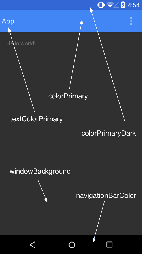
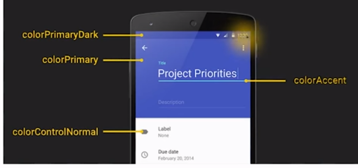
  <item name="colorPrimary">@color/colorPrimary</item>
  <item name="colorPrimaryDark">@color/colorPrimaryDark</item>
  <item name="colorAccent">@color/colorAccent</item>
</style>

<style name="ToolbarTheme" parent="@style/ThemeOverlay.AppCompat.Dark.ActionBar">
  <!-- This would set the toolbar's background color -->
  <item name="android:background">@color/colorPrimary</item>
  <!-- android:textColorPrimary is the color of the title text in the Toolbar  -->
  <item name="android:textColorPrimary">@android:color/holo_blue_light</item>
  <!-- android:actionMenuTextColor is the color of the text of action (menu) items  -->
  <item name="actionMenuTextColor">@android:color/holo_green_light</item>
  <!-- Enable these below if you want clicking icons to trigger a ripple effect -->
  <!-- 
  <item name="selectableItemBackground">?android:selectableItemBackground</item>
  <item name="selectableItemBackgroundBorderless">?android:selectableItemBackground</item> 
  -->
</style>

<!-- This configures the styles for the title within the Toolbar  -->
<style name="Toolbar.TitleText" parent="TextAppearance.Widget.AppCompat.Toolbar.Title">
    <item name="android:textSize">21sp</item>
    <item name="android:textStyle">italic</item>
</style>
This results in:

Displaying an App Icon

In certain situations, we might want to display an app icon within the Toolbar. This can be done by adding this code into theActivity
// Find the toolbar view and set as ActionBar
Toolbar toolbar = (Toolbar) findViewById(R.id.toolbar);
setSupportActionBar(toolbar);
// ...
// Display icon in the toolbar
getSupportActionBar().setDisplayShowHomeEnabled(true);
getSupportActionBar().setLogo(R.mipmap.ic_launcher);
getSupportActionBar().setDisplayUseLogoEnabled(true);
Next, we need to remove the left inset margin that pushes the icon over too far to the left by adding app:contentInsetStart to the Toolbar:
<android.support.v7.widget.Toolbar
      android:id="@+id/toolbar"
      app:contentInsetLeft="0dp"
      app:contentInsetStart="0dp"
      ...
      >
</android.support.v7.widget.Toolbar>
With that the icon should properly display within the ToolBar as expected.

Custom Title View

Toolbar is just a decorated ViewGroup and as a result, the title contained within can be completely customized by embedding a view within the Toolbar such as:
<android.support.v7.widget.Toolbar
    android:id="@+id/toolbar"
    android:minHeight="?attr/actionBarSize"  
    android:layout_width="match_parent"
    android:layout_height="wrap_content"
    app:titleTextColor="@android:color/white"
    android:background="?attr/colorPrimary">

     <TextView
        android:id="@+id/toolbar_title"
        android:layout_width="wrap_content"
        android:layout_height="wrap_content"
        android:text="Toolbar Title"
        android:textColor="@android:color/white"
        style="@style/TextAppearance.AppCompat.Widget.ActionBar.Title"
        android:layout_gravity="center"
     />

</android.support.v7.widget.Toolbar>
This means that you can style the TextView like any other. You can access the TextView inside your activity with:
/* Inside the activity */
// Sets the Toolbar to act as the ActionBar for this Activity window.
Toolbar toolbar = (Toolbar) findViewById(R.id.toolbar);
setSupportActionBar(toolbar);
// Remove default title text
getSupportActionBar().setDisplayShowTitleEnabled(false);
// Get access to the custom title view
TextView mTitle = (TextView) toolbar.findViewById(R.id.toolbar_title);
Note that you must hide the default title using setDisplayShowTitleEnabled. This results in:

2016年1月31日 星期日

Android visual part-Make the app more beautiful

Make the app more beautiful
desihner will give us the readline


value come from android design guide


First,we style the action bar
from
to


Some basic concept:
The use of the theme:
in AndroidManifest.xml


it defined


<application
  android:allowBackup="true"
  android:icon="@mipmap/ic_launcher"
  android:label="@string/app_name"
  android:theme="@style/AppTheme" >


the using theme id @style/AppTheme.


In the style.xml,we find <style name="AppTheme" parent="Theme.AppCompat.Light.DarkActionBar">
  <!-- Customize your theme here. -->
</style>


we can change the color of the bar at here
Color that we can use:


How to set the color of the action bar?


forexample:
<style name="AppTheme" parent="@style/Theme.AppCompat.Light.DarkActionBar">
  <item name="colorPrimary">@color/sunshine_blue</item>
  <item name="colorPrimaryDark">@color/sunshine_dark_blue</item>
</style>


now The color is changed.


Than we want to show the logo.


<application
  android:allowBackup="true"
  android:icon="@mipmap/ic_launcher"
  android:label="@string/app_name"
  android:theme="@style/AppTheme" >


the AppTheme will effect the hole app,because we set the theme at the application
Show the Logo
we have the logo in the drawable file.We only want to show this logo at the Main activity,
so,this time we need to set the theme at the Mainactivity at in AndroidManifest.xml.


like this


<activity
  android:name=".MainActivity"
  android:label="@string/app_name"
  android:theme="@style/ForecastTheme">


But how can we in the action bar that show the logo,not show app name and ICON?


we need to have this;


<style name="ActionBar.Solid.Sunshine.NoTitle" parent="@style/Widget.AppCompat.Light.ActionBar.Solid.Inverse">
  <item name="displayOptions">useLogo|showHome</item>
  <item name="logo">@drawable/ic_logo</item>
</style>


explain of the displayoption:


useLogo:

Use logo instead of icon if available. This flag will cause appropriate navigation modes to use a wider logo in place of the standard icon.

showHome:

Show 'home' elements (logo and icon) in this action bar, leaving more space for other navigation elements.

homeAsUp:

Display the 'home' element such that it appears as an 'up' affordance. e.g. show an arrow to the left indicating the action that will be taken. Set this flag if selecting the 'home' button in the action bar to return up by a single level in your UI rather than back to the top level or front page. Remember, that you can declare the logical parent of each activity by specifying the android:parentActivityName attribute in the element.

showTitle:

Show the activity title and subtitle, if present.

showCustom:

Show the custom view if one has been set.

disableHome:

haven't found this one, but there's a function setHomeButtonEnabled(boolean) in ActionBar class which can help to enable or disable home button.


So,we need to use show home ,and than use logo,finally set the logo


<style name="ForecastTheme" parent="AppTheme">
  <item name="actionBarStyle">@style/ActionBar.Solid.Sunshine.NoTitle</item>
</style>


the parent is AppTheme because we want to keep the avtionBar color,and than override the


actionBarStyle.But don't want to show title

so:
<activity android:name=".MainActivity" android:theme="@style/ForecastTheme" android:label="@string/app_name" >


How can we disable the shadow of the action bar?


getSupportActionBar().setElevation(0);

Now the hole app isusing the


Why our SetingActivity noActionBar?
It is becasue our activity is using subclass of ActionBarActivity, it need a a theme that is  Child of @style/Theme.AppCompat, and we need action bar ,so fianlly we use


<style name="AppTheme" parent="@style/Theme.AppCompat.Light.DarkActionBar">
  <item name="colorPrimary">@color/sunshine_blue</item>
  <item name="colorPrimaryDark">@color/sunshine_dark_blue</item>
</style>


However, the Theme.AppCompat.Light.DarkActionBar only can dds an action bar to activities that derive from ActionBarActivity and SettingsActivity does not subclass ActionBarActivity. SettingsActivity is a subclass of PreferenceActivity.


So why are we using PreferenceActivity? It’s an easy way to get the preference UI working on Gingerbread devices.


so,our SeetingActivity have no action bar.


so,we need to create another style special for the SettingActivity, in the style,


<style name="SettingsTheme" >


</style>


than we apply it,


android:theme="@style/SettingsTheme">


We know it will not have any effect,because it is empty.


We try,we find that if parent is @android:style/Theme.Holo.Light.DarkActionBar


the action bar appear!!!


<style name="SettingsTheme" parent="@android:style/Theme.Holo.Light.DarkActionBar">


now,we can try to style it.


How ? let see the source code of @android:style/Theme.Holo.Light.DarkActionBar"


<style name="Theme.Holo.Light.DarkActionBar">
  <item name="windowContentOverlay">@drawable/ab_solid_shadow_holo</item>
  <item name="actionBarStyle">@style/Widget.Holo.Light.ActionBar.Solid.Inverse</item>
  <item name="actionBarWidgetTheme">@style/Theme.Holo</item>
  <item name="actionBarTheme">@null</item>


  <item name="actionDropDownStyle">@style/Widget.Holo.Spinner.DropDown.ActionBar</item>
  <item name="actionButtonStyle">@style/Widget.Holo.ActionButton</item>
  <item name="actionOverflowButtonStyle">@style/Widget.Holo.ActionButton.Overflow</item>
  <item name="actionModeBackground">@drawable/cab_background_top_holo_dark</item>
  <item name="actionModeSplitBackground">@drawable/cab_background_bottom_holo_dark</item>
  <item name="actionModeCloseDrawable">@drawable/ic_cab_done_holo_dark</item>
  <item name="homeAsUpIndicator">@drawable/ic_ab_back_holo_dark</item>
  <item name="actionBarTabStyle">@style/Widget.Holo.Light.ActionBar.TabView.Inverse</item>
  <item name="actionBarTabBarStyle">@style/Widget.Holo.Light.ActionBar.TabBar.Inverse</item>
  <item name="actionBarTabTextStyle">@style/Widget.Holo.Light.ActionBar.TabText.Inverse</item>
  <item name="actionBarDivider">@drawable/list_divider_holo_dark</item>
  <item name="actionBarItemBackground">@drawable/item_background_holo_dark</item>
  <item name="actionMenuTextColor">?attr/textColorPrimaryInverse</item>
  <item name="actionModeStyle">@style/Widget.Holo.Light.ActionMode.Inverse</item>
  <item name="actionModeCloseButtonStyle">@style/Widget.Holo.ActionButton.CloseMode</item>
  <item name="actionModePopupWindowStyle">@style/Widget.Holo.PopupWindow.ActionMode</item>


  <item name="actionModeCutDrawable">@drawable/ic_menu_cut_holo_dark</item>
  <item name="actionModeCopyDrawable">@drawable/ic_menu_copy_holo_dark</item>
  <item name="actionModePasteDrawable">@drawable/ic_menu_paste_holo_dark</item>
  <item name="actionModeSelectAllDrawable">@drawable/ic_menu_selectall_holo_dark</item>
  <item name="actionModeShareDrawable">@drawable/ic_menu_share_holo_dark</item>
  <item name="actionModeFindDrawable">@drawable/ic_menu_find_holo_dark</item>
  <item name="actionModeWebSearchDrawable">@drawable/ic_menu_search_holo_dark</item>
</style>


we find


<item name="actionBarStyle">@style/Widget.Holo.Light.ActionBar.Solid.Inverse</item>


so go to source code of @style/Widget.Holo.Light.ActionBar.Solid.Inverse


<style name="Widget.Holo.Light.ActionBar.Solid.Inverse">
  <item name="titleTextStyle">@style/TextAppearance.Holo.Widget.ActionBar.Title.Inverse</item>
  <item name="subtitleTextStyle">@style/TextAppearance.Holo.Widget.ActionBar.Subtitle.Inverse</item>
  <item name="background">@drawable/ab_solid_dark_holo</item>
  <item name="backgroundStacked">@drawable/ab_stacked_solid_dark_holo</item>
  <item name="backgroundSplit">@drawable/ab_bottom_solid_inverse_holo</item>
  <item name="divider">@drawable/list_divider_holo_dark</item>
  <item name="progressBarStyle">@style/Widget.Holo.ProgressBar.Horizontal</item>
  <item name="indeterminateProgressStyle">@style/Widget.Holo.ProgressBar</item>
  <item name="progressBarPadding">32dip</item>
  <item name="itemPadding">8dip</item>
</style>


background can change trhe color of the action bar.


so, we ffirst override the actionBarStyle than override the background


<resources>


  <!--<style name="SettingsTheme" parent="@android:style/Theme.Holo.Light.DarkActionBar">-->
      <!-- -->
  <!--</style>-->
  <style name="SettingsTheme" parent="@android:style/Theme.Holo.Light.DarkActionBar">
      <!--<item name="android:background">@color/sunshine_blue</item>-->
      <item name="android:actionBarStyle">@style/ActionBar.V14.Sunshine.NoTitle</item>


  </style>
  <style name="ActionBar.V14.Sunshine.NoTitle" parent="@android:style/Widget.Holo.Light.ActionBar.Solid.Inverse">
      <item name="android:background">@color/sunshine_blue</item>
      <!--<item name="android:height">56dp</item>-->
  </style>
</resources>


Now ,the actionBar in the setting action is blue!!!


however, the height is different to the MainActivity and we don’t want the icon


for different


add


<item name="android:height">56dp</item>


for no icon?


use toolbar to solve?study later!!!!!   toolbar is the future
how to add a appbar


how to style:


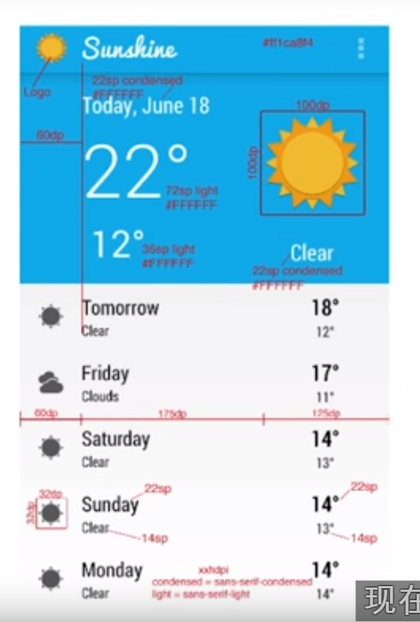
UI- Implementing Redlines


example:

32 dp icon


frist we handle the 32dp x32 dp icon.we can only had code,however,if we wnat to keep the icon has good quality in different dpi screen,we should prepare different px icon
A set of six generalized densities:
  • ldpi (low) ~120dpi
  • mdpi (medium) ~160dpi
  • hdpi (high) ~240dpi
  • xhdpi (extra-high) ~320dpi
  • xxhdpi (extra-extra-high) ~480dpi
  • xxxhdpi (extra-extra-extra-high) ~640dpi
for example,if we need a 32dpx 32dp in hdpi screen:
x/32=240/160
x=48px


so,for hdpi,the icon need 48px x 48px


hdpi
48px
xhdpi
64px
xxhdpi
96px
xxxhdpi
128px


after we prepare the right icon,and put in the right foder,the image view can set to wrap_content


<ImageView
  android:id="@+id/list_item_icon"
  android:layout_width="wrap_content"
  android:layout_height="wrap_content" />


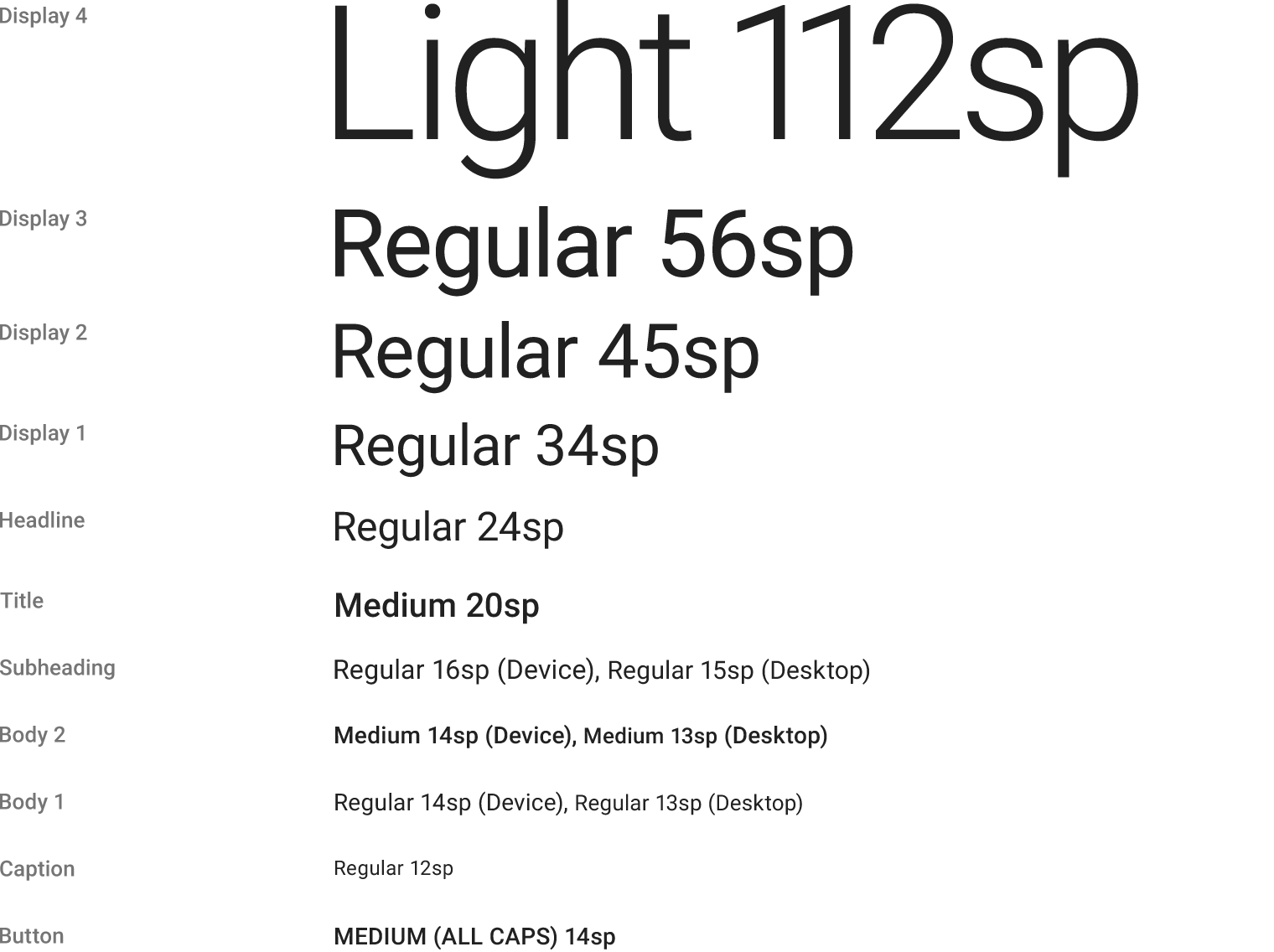
The Text size and font family

android:fontFamily="sans-serif-condensed"

how to decide the text sixe?
<TextView
  android:id="@+id/list_item_date_textview"
  android:layout_width="wrap_content"
  android:layout_height="wrap_content"


  android:textAppearance="?android:textAppearanceLarge"/>


<TextView
  android:id="@+id/list_item_forecast_textview"
  android:layout_width="wrap_content"
  android:layout_height="wrap_content"
  android:fontFamily="sans-serif-condensed"
  android:textAppearance="?android:textAppearanceSmall"
  />


22sp:android:textAppearance="?android:textAppearanceSmall"
24sp:android:textAppearance="?android:textAppearanceLarge"


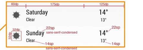
Three part:60dp,175dp,125dp
set the 60dp part as 60dp,
175dp ,125 dp part ,use weight, 7/5


so, the system after give 60dp to the image view,other space will give the 175dp amd 125 dp part. They will use 7:5 way to divide this space.


Special thing!!!


<LinearLayout
  android:layout_width="0dp"
  android:layout_height="wrap_content"
  android:layout_weight="7"
  android:orientation="vertical">


  <TextView
      android:id="@+id/list_item_date_textview"
      android:layout_width="wrap_content"
      android:layout_height="wrap_content"


      android:textAppearance="?android:textAppearanceLarge" />


  <TextView
      android:id="@+id/list_item_forecast_textview"
      android:layout_width="wrap_content"
      android:layout_height="wrap_content"
      android:fontFamily="sans-serif-condensed"
      android:textAppearance="?android:textAppearanceSmall" />
</LinearLayout>


if set match parent,we not show all the content,because the hight is not dependency the content hight.It is dependeny the parent, at the original, the height of the parent is not enough to show all the content in this layout.


Gravity vs Layout Gravity
First off, the difference between android:gravity and android:layout_gravity is that android:gravitypositions the contents of that view (i.e. what’s inside the view), whereas android:layout_gravitypositions the view with respect to its parent (i.e. what the view is contained in).