Make the app more beautiful
ref:red linehttps://www.udacity.com/wiki/ud853/design_assets
desihner will give us the readline
value come from android design guide
google layout:Layout–Metrics & keylines
First,we style the action bar
from
to

Some basic concept:
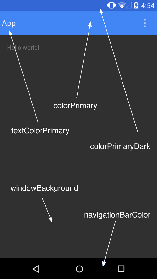
The use of the theme:
in AndroidManifest.xml
it defined
<application
android:allowBackup="true"
android:icon="@mipmap/ic_launcher"
android:label="@string/app_name"
android:theme="@style/AppTheme" >
the using theme id @style/AppTheme.
In the style.xml,we find <style name="AppTheme" parent="Theme.AppCompat.Light.DarkActionBar">
<!-- Customize your theme here. -->
</style>
we can change the color of the bar at here
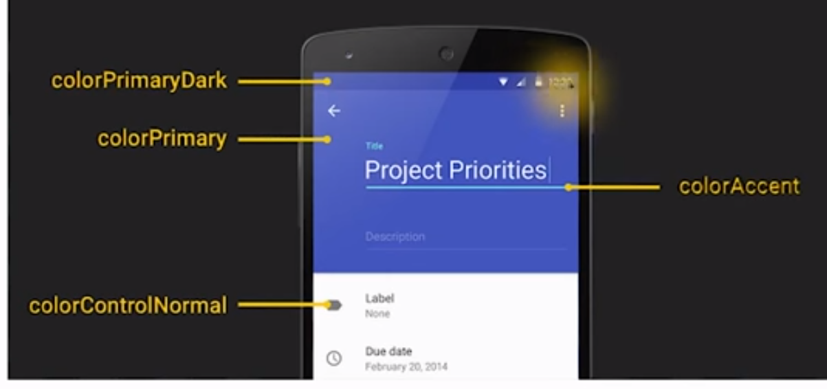
Color that we can use:
How to set the color of the action bar?
forexample:
<style name="AppTheme" parent="@style/Theme.AppCompat.Light.DarkActionBar">
<item name="colorPrimary">@color/sunshine_blue</item>
<item name="colorPrimaryDark">@color/sunshine_dark_blue</item>
</style>
now The color is changed.
Than we want to show the logo.
<application
android:allowBackup="true"
android:icon="@mipmap/ic_launcher"
android:label="@string/app_name"
android:theme="@style/AppTheme" >
the AppTheme will effect the hole app,because we set the theme at the application
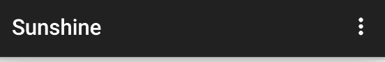
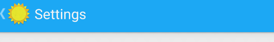
Show the Logo

we have the logo in the drawable file.We only want to show this logo at the Main activity,
so,this time we need to set the theme at the Mainactivity at in AndroidManifest.xml.
like this
<activity
android:name=".MainActivity"
android:label="@string/app_name"
android:theme="@style/ForecastTheme">
But how can we in the action bar that show the logo,not show app name and ICON?
we need to have this;
<style name="ActionBar.Solid.Sunshine.NoTitle" parent="@style/Widget.AppCompat.Light.ActionBar.Solid.Inverse">
<item name="displayOptions">useLogo|showHome</item>
<item name="logo">@drawable/ic_logo</item>
</style>
explain of the displayoption:
useLogo:
Use logo instead of icon if available. This flag will cause appropriate navigation modes to use a wider logo in place of the standard icon.
showHome:
Show 'home' elements (logo and icon) in this action bar, leaving more space for other navigation elements.
homeAsUp:
Display the 'home' element such that it appears as an 'up' affordance. e.g. show an arrow to the left indicating the action that will be taken. Set this flag if selecting the 'home' button in the action bar to return up by a single level in your UI rather than back to the top level or front page. Remember, that you can declare the logical parent of each activity by specifying the android:parentActivityName attribute in the element.
showTitle:
Show the activity title and subtitle, if present.
showCustom:
Show the custom view if one has been set.
disableHome:
haven't found this one, but there's a function setHomeButtonEnabled(boolean) in ActionBar class which can help to enable or disable home button.
So,we need to use show home ,and than use logo,finally set the logo
<style name="ForecastTheme" parent="AppTheme">
<item name="actionBarStyle">@style/ActionBar.Solid.Sunshine.NoTitle</item>
</style>
the parent is AppTheme because we want to keep the avtionBar color,and than override the
actionBarStyle.But don't want to show title
so:
<activity
android:name=".MainActivity"
android:theme="@style/ForecastTheme"
android:label="@string/app_name" >
How can we disable the shadow of the action bar?


getSupportActionBar().setElevation(0);
Now the hole app isusing the
Now the hole app isusing the
Why our SetingActivity noActionBar?
It is becasue our activity is using subclass of ActionBarActivity, it need a a theme that is Child of @style/Theme.AppCompat, and we need action bar ,so fianlly we use
<style name="AppTheme" parent="@style/Theme.AppCompat.Light.DarkActionBar">
<item name="colorPrimary">@color/sunshine_blue</item>
<item name="colorPrimaryDark">@color/sunshine_dark_blue</item>
</style>
However, the Theme.AppCompat.Light.DarkActionBar only can dds an action bar to activities that derive from ActionBarActivity and SettingsActivity does not subclass ActionBarActivity. SettingsActivity is a subclass of PreferenceActivity.
So why are we using PreferenceActivity? It’s an easy way to get the preference UI working on Gingerbread devices.
so,our SeetingActivity have no action bar.
so,we need to create another style special for the SettingActivity, in the style,
<style name="SettingsTheme" >
</style>
than we apply it,
android:theme="@style/SettingsTheme">
We know it will not have any effect,because it is empty.
We try,we find that if parent is @android:style/Theme.Holo.Light.DarkActionBar
the action bar appear!!!
<style name="SettingsTheme" parent="@android:style/Theme.Holo.Light.DarkActionBar">
now,we can try to style it.
How ? let see the source code of @android:style/Theme.Holo.Light.DarkActionBar"
<style name="Theme.Holo.Light.DarkActionBar">
<item name="windowContentOverlay">@drawable/ab_solid_shadow_holo</item>
<item name="actionBarStyle">@style/Widget.Holo.Light.ActionBar.Solid.Inverse</item>
<item name="actionBarWidgetTheme">@style/Theme.Holo</item>
<item name="actionBarTheme">@null</item>
<item name="actionDropDownStyle">@style/Widget.Holo.Spinner.DropDown.ActionBar</item>
<item name="actionButtonStyle">@style/Widget.Holo.ActionButton</item>
<item name="actionOverflowButtonStyle">@style/Widget.Holo.ActionButton.Overflow</item>
<item name="actionModeBackground">@drawable/cab_background_top_holo_dark</item>
<item name="actionModeSplitBackground">@drawable/cab_background_bottom_holo_dark</item>
<item name="actionModeCloseDrawable">@drawable/ic_cab_done_holo_dark</item>
<item name="homeAsUpIndicator">@drawable/ic_ab_back_holo_dark</item>
<item name="actionBarTabStyle">@style/Widget.Holo.Light.ActionBar.TabView.Inverse</item>
<item name="actionBarTabBarStyle">@style/Widget.Holo.Light.ActionBar.TabBar.Inverse</item>
<item name="actionBarTabTextStyle">@style/Widget.Holo.Light.ActionBar.TabText.Inverse</item>
<item name="actionBarDivider">@drawable/list_divider_holo_dark</item>
<item name="actionBarItemBackground">@drawable/item_background_holo_dark</item>
<item name="actionMenuTextColor">?attr/textColorPrimaryInverse</item>
<item name="actionModeStyle">@style/Widget.Holo.Light.ActionMode.Inverse</item>
<item name="actionModeCloseButtonStyle">@style/Widget.Holo.ActionButton.CloseMode</item>
<item name="actionModePopupWindowStyle">@style/Widget.Holo.PopupWindow.ActionMode</item>
<item name="actionModeCutDrawable">@drawable/ic_menu_cut_holo_dark</item>
<item name="actionModeCopyDrawable">@drawable/ic_menu_copy_holo_dark</item>
<item name="actionModePasteDrawable">@drawable/ic_menu_paste_holo_dark</item>
<item name="actionModeSelectAllDrawable">@drawable/ic_menu_selectall_holo_dark</item>
<item name="actionModeShareDrawable">@drawable/ic_menu_share_holo_dark</item>
<item name="actionModeFindDrawable">@drawable/ic_menu_find_holo_dark</item>
<item name="actionModeWebSearchDrawable">@drawable/ic_menu_search_holo_dark</item>
</style>
we find
<item name="actionBarStyle">@style/Widget.Holo.Light.ActionBar.Solid.Inverse</item>
so go to source code of @style/Widget.Holo.Light.ActionBar.Solid.Inverse
<style name="Widget.Holo.Light.ActionBar.Solid.Inverse">
<item name="titleTextStyle">@style/TextAppearance.Holo.Widget.ActionBar.Title.Inverse</item>
<item name="subtitleTextStyle">@style/TextAppearance.Holo.Widget.ActionBar.Subtitle.Inverse</item>
<item name="background">@drawable/ab_solid_dark_holo</item>
<item name="backgroundStacked">@drawable/ab_stacked_solid_dark_holo</item>
<item name="backgroundSplit">@drawable/ab_bottom_solid_inverse_holo</item>
<item name="divider">@drawable/list_divider_holo_dark</item>
<item name="progressBarStyle">@style/Widget.Holo.ProgressBar.Horizontal</item>
<item name="indeterminateProgressStyle">@style/Widget.Holo.ProgressBar</item>
<item name="progressBarPadding">32dip</item>
<item name="itemPadding">8dip</item>
</style>
background can change trhe color of the action bar.
so, we ffirst override the actionBarStyle than override the background
<resources>
<!--<style name="SettingsTheme" parent="@android:style/Theme.Holo.Light.DarkActionBar">-->
<!-- -->
<!--</style>-->
<style name="SettingsTheme" parent="@android:style/Theme.Holo.Light.DarkActionBar">
<!--<item name="android:background">@color/sunshine_blue</item>-->
<item name="android:actionBarStyle">@style/ActionBar.V14.Sunshine.NoTitle</item>
</style>
<style name="ActionBar.V14.Sunshine.NoTitle" parent="@android:style/Widget.Holo.Light.ActionBar.Solid.Inverse">
<item name="android:background">@color/sunshine_blue</item>
<!--<item name="android:height">56dp</item>-->
</style>
</resources>
Now ,the actionBar in the setting action is blue!!!
however, the height is different to the MainActivity and we don’t want the icon
for different
add
<item name="android:height">56dp</item>
for no icon?
use toolbar to solve?study later!!!!! toolbar is the future
how to add a appbar
how to style:
UI- Implementing Redlines
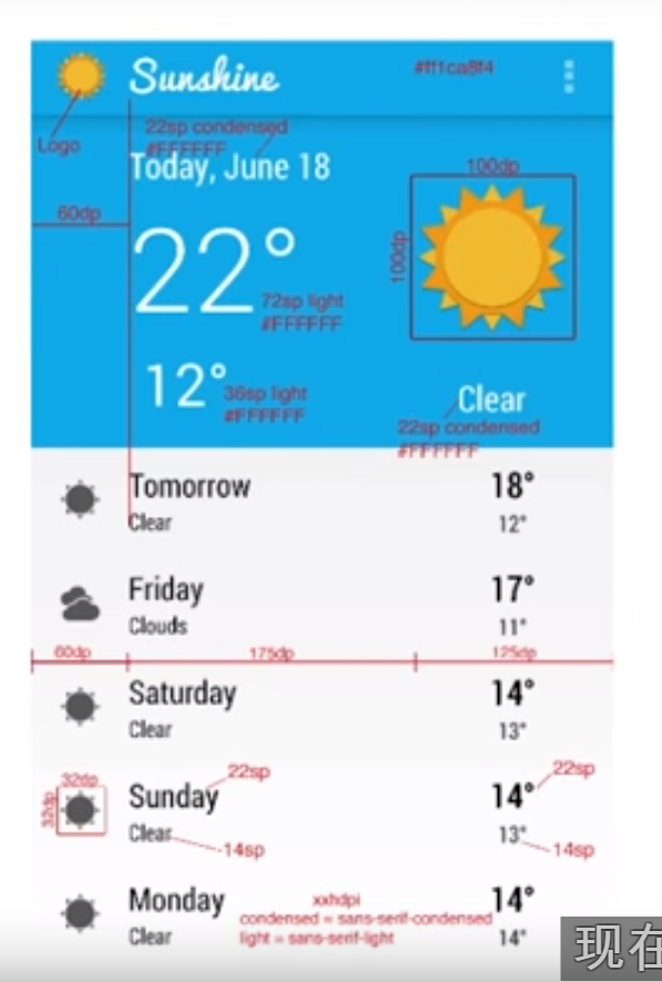
example:
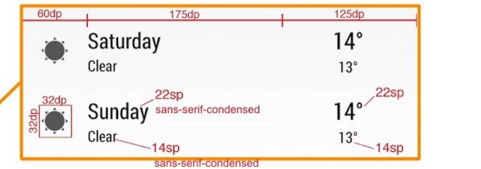
32 dp icon
frist we handle the 32dp x32 dp icon.we can only had code,however,if we wnat to keep the icon has good quality in different dpi screen,we should prepare different px icon

A set of six generalized densities:
- ldpi (low) ~120dpi
- mdpi (medium) ~160dpi
- hdpi (high) ~240dpi
- xhdpi (extra-high) ~320dpi
- xxhdpi (extra-extra-high) ~480dpi
- xxxhdpi (extra-extra-extra-high) ~640dpi
for example,if we need a 32dpx 32dp in hdpi screen:
x/32=240/160
x=48px
so,for hdpi,the icon need 48px x 48px
hdpi
|
48px
|
xhdpi
|
64px
|
xxhdpi
|
96px
|
xxxhdpi
|
128px
|
after we prepare the right icon,and put in the right foder,the image view can set to wrap_content
<ImageView
android:id="@+id/list_item_icon"
android:layout_width="wrap_content"
android:layout_height="wrap_content" />
The Text size and font family
android:fontFamily="sans-serif-condensed"
how to decide the text sixe?
<TextView
android:id="@+id/list_item_date_textview"
android:layout_width="wrap_content"
android:layout_height="wrap_content"
android:textAppearance="?android:textAppearanceLarge"/>
<TextView
android:id="@+id/list_item_forecast_textview"
android:layout_width="wrap_content"
android:layout_height="wrap_content"
android:fontFamily="sans-serif-condensed"
android:textAppearance="?android:textAppearanceSmall"
/>
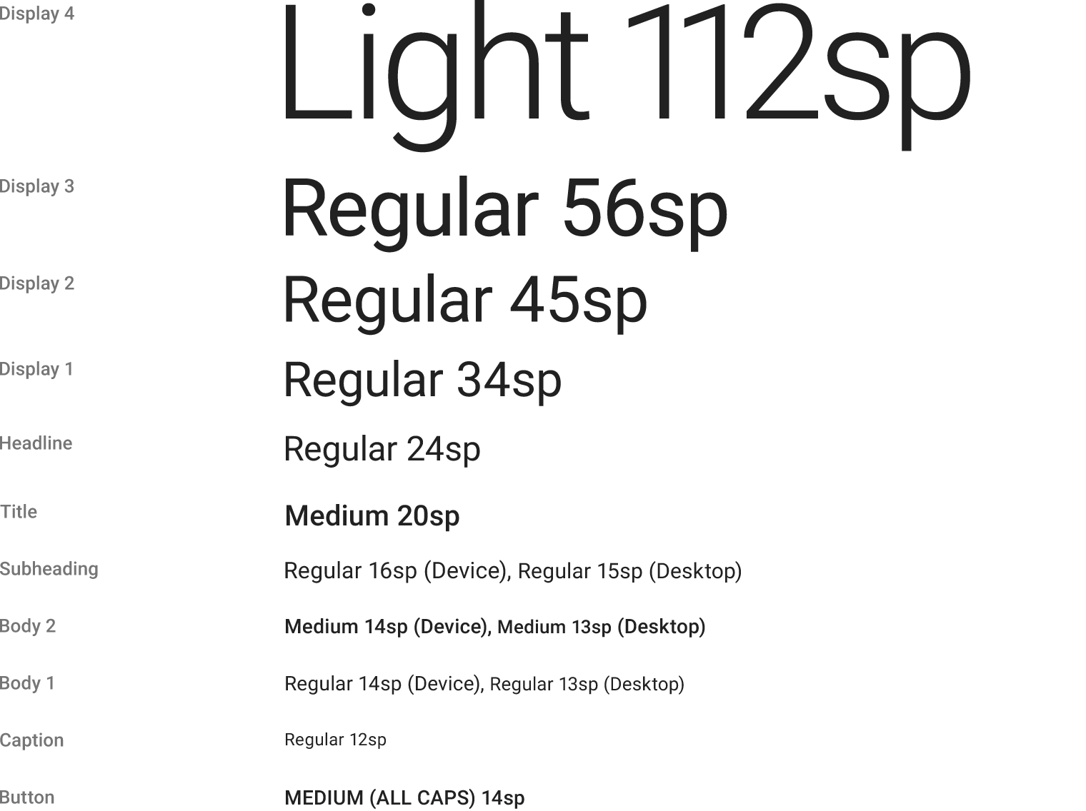
22sp:android:textAppearance="?android:textAppearanceSmall"
24sp:android:textAppearance="?android:textAppearanceLarge"
Three part:60dp,175dp,125dp
set the 60dp part as 60dp,
175dp ,125 dp part ,use weight, 7/5
so, the system after give 60dp to the image view,other space will give the 175dp amd 125 dp part. They will use 7:5 way to divide this space.
Special thing!!!
<LinearLayout
android:layout_width="0dp"
android:layout_height="wrap_content"
android:layout_weight="7"
android:orientation="vertical">
<TextView
android:id="@+id/list_item_date_textview"
android:layout_width="wrap_content"
android:layout_height="wrap_content"
android:textAppearance="?android:textAppearanceLarge" />
<TextView
android:id="@+id/list_item_forecast_textview"
android:layout_width="wrap_content"
android:layout_height="wrap_content"
android:fontFamily="sans-serif-condensed"
android:textAppearance="?android:textAppearanceSmall" />
</LinearLayout>
if set match parent,we not show all the content,because the hight is not dependency the content hight.It is dependeny the parent, at the original, the height of the parent is not enough to show all the content in this layout.
Gravity vs Layout Gravity
First off, the difference between android:gravity and android:layout_gravity is that android:gravitypositions the contents of that view (i.e. what’s inside the view), whereas android:layout_gravitypositions the view with respect to its parent (i.e. what the view is contained in).