MATERIAL DESIGN FOR ANDROID DEVELOPERS
1.Physical And Density Independent Pixels
we need to think about the pgusical size of the screen,not only the pixels

the unit is dp.

if the dpi is double,the px is double,but the dp is still the same.
that,mean,at 320 dpi,1dp =2px.so on every different dpi,the size of 1 dp should be the same pgysically if the size of the screen is same,although they have the different resoultioon.
First example:same pixels but different pgysical size
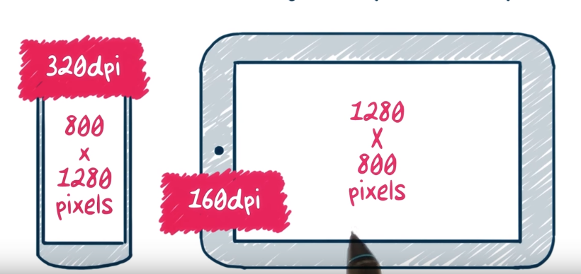
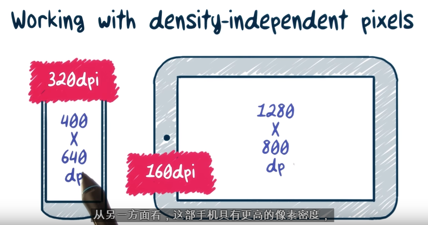
above tablet and phone has same pixel.
however,their dp is not the same. the tablet is 160dpi.1280/xdp=160/160,x=1280.
for the phone.1280/xdp=320/160 x=640dp
second example.same physical screen size but different pixcel

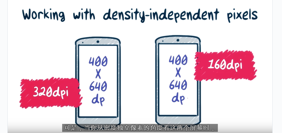
the dp is the same
Conclusion:
for the screen they have same physical,they must have same dp,although their resoultion is not the same.
so,when we design ,we use dp as a unit,we only consider the physical size of the screen is ok,no need to think about the resoultion.
2.Small Screens First
we should design for the small screen first,becasue although the app in the big screen will have many spance,it still canrun.if design for big screen first,the thing in the small screen will very small,can’t use.
3.Density buckets
we will asign the different desnity to different bucket

311 dpi is asign to 320dpi bucket,that mean XHDPI.
Generely,we only work for MDPI,HDPI,XHDPI,XXHDPI
4.Density for Asset Crispness

we need provide the different dpi image to the app,or we can just provide the high resoultion one to the app,Android system will down sampling it. However,this method will has a bed effect to the performace.Moever,the dow sampling si specific for high speed,so the quality will not very good if the dow sampling gag is very big,e.g.,1600x1600 to 200x200.
we can use the tool to create different dpi icon and image when we develop the app:
5.Vector vs Bitmap
android also support vector,we don’t not need a bunch of bitmap.
6.Resource Qualifier

Normally,we put the image resource into the drawable folder for different dpi,.However,we can see that one drawable do not have Qualifier.it is drawable-nodpi.This folder is gor XML or the resource that will not zoom in or out for different screen.
ref:
7.State Lists

8.Getting Started with Layouts

9.Common Design Patterns
1Toolbar

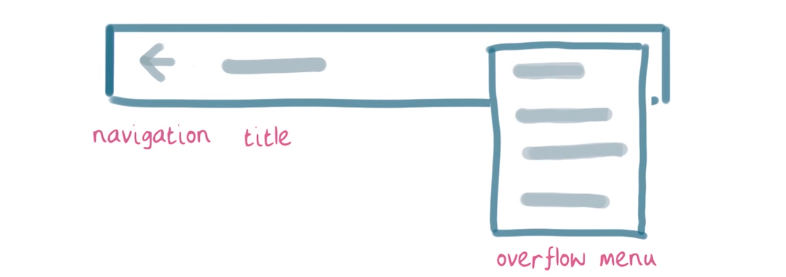

the height of actionbar :a standard height whicj varies by screen size
2.Appbar
a special case of toolbar,at the top of the screen,show the title
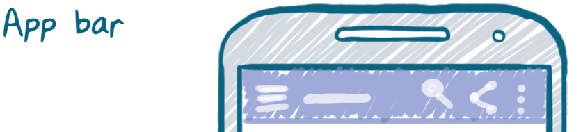
app bar can extend the stand height,to provide a header of branding,use the multiple of standard height.
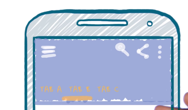
3. tap
4.Navigation Drawer
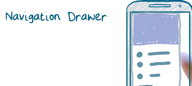
it can provide different section

always is click the three icon to show the Drawer
when drawer ,when tap?If many section,and occupy many space,use drawer,if just little section to show,use tap.
5.scrolling and paging

horizontal paginf is useful when see e,ail and news
List:list to detail,cliack a iteam of a list,and show other page
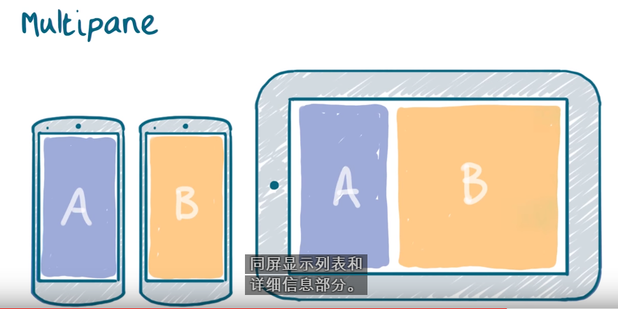
6.mulitplane
10.Introduction to Themes and Styles
Themes and Styles.android use them to define the reuseable attribute,like css
thgeme and style use the same syntax.But theme apply a collection of style to a elment,activity,and whole application.Style operate on a single element.
Example,make all the button pick in the application
create a style to do it,than apply to the whole application theme
11.Adding a style
atep1.
at styles.xml,create an other style:
<style name="AnotherStyle">
<item name="android:textColor">@color/textColor</item>
</style>
step2
use it:
<TextView
android:layout_width="wrap_content"
android:layout_height="wrap_content"
android:text="Hello World!"
style="@style/AnotherStyle"/>
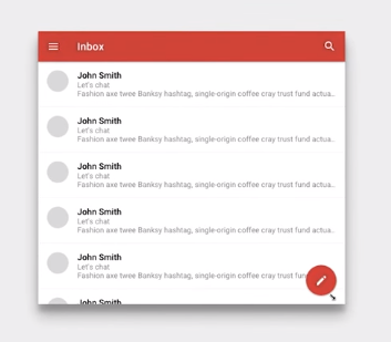
List of free and open-source Android applications
Material DESIGN~Surface
the concept of Material DESIGN is paper,the shadow show the x axis

Using Surfaces
see some example:

the above is not a good example,becasue although each column use a surface,can net the user know they a different cintent,but that will make the reading slow and they are same type.
we should use
another example:

because the iteam is not same type,so we should put on different surface.
太多surface,分散注意力,最多5個!!
Implementing Surfaces

<?xml version="1.0" encoding="utf-8"?>
<LinearLayout xmlns:android="http://schemas.android.com/apk/res/android"
xmlns:tools="http://schemas.android.com/tools"
android:layout_width="match_parent"
android:layout_height="match_parent"
android:background="@color/colorbackgroundWhite"
android:orientation="vertical"
tools:context="pom2.poly.com.trysurface.MainActivity">
<FrameLayout
android:layout_width="match_parent"
android:layout_height="200dp"
android:layout_margin="16dp"
android:background="@color/colorbackgroundWhite"
android:elevation="4dp" />
<FrameLayout
android:layout_width="match_parent"
android:layout_height="200dp"
android:layout_margin="16dp"
android:background="@color/colorbackgroundWhite"
android:elevation="8dp" />
<FrameLayout
android:layout_width="match_parent"
android:layout_height="200dp"
android:layout_margin="16dp"
android:background="@color/colorbackgroundWhite"
android:elevation="16dp" />
</LinearLayout>
|
when the value of elevation more high,the the surface is more top.
Making Surfaces

how can we make the above UI susing surface?

this three part put on different surface
the third part will not appear,becuase of some reason.
suggest elevation
Elevation (dp)
|
Component
|
24
|
Dialog
Picker
|
16
|
Nav drawer
Right drawer
Modal bottom Sheet
|
12
|
Floating action button (FAB - pressed)
|
9
|
Sub menu (+1dp for each sub menu)
|
8
|
Bottom navigation bar
Menu
Card (picked up state)
Raised button (pressed state)
|
6
|
Floating action button (FAB - resting elevation)
Snackbar
|
4
|
App Bar
|
3
|
Refresh indicator
Quick entry / Search bar (scrolled state)
|
2
|
Card (resting elevation) *
Raised button (resting elevation)*
Quick entry / Search bar (resting elevation)
|
1
|
Switch
|
What is a Fab

it always at the top
standard size

can place at everywhere,evem the 界面的交接位
every screen only can have on FAB
what should be a FAB?

Scan.becasue is a action,other just Nounce,not a action
Adding a FAB
step1
dependencies {
compile fileTree(dir: 'libs', include: ['*.jar'])
compile 'com.android.support:appcompat-v7:22.2.0'
compile 'com.android.support:design:22.2.0'
}
step2
important!!!! need to use with android.support.design.widget.CoordinatorLayout
<android.support.design.widget.FloatingActionButton
android:layout_width="wrap_content"
android:layout_height="wrap_content"
android:layout_alignTop="@+id/fab"
android:layout_marginLeft="16dp"
android:layout_marginRight="16dp"
android:layout_toEndOf="@+id/fab"
android:src="@drawable/fab_plus"
app:borderWidth="0dp"
app:elevation="6dp"
app:fabSize="normal"
app:layout_anchorGravity="bottom|right|end"
app:pressedTranslationZ="12dp" />
normal elevationis 6dp
pressed elevationis 12dp
Size is normal
layout_anchorGravity:
step3 style.xml

must use :
<style name="AppTheme" parent="Theme.AppCompat.Light.DarkActionBar">
if not,will have error
Adding Ripple/Surface Elevation to a FAB
how to nake a FAB by ourself?
1.create a image button
<ImageButton
android:id="@+id/fab"
android:layout_width="56dp"
android:layout_height="56dp"
android:layout_alignParentStart="true"
android:layout_alignParentTop="true"
android:layout_marginStart="19dp"
android:layout_marginTop="15dp"
/>
|
2.create a vector image for it
<ImageButton
android:id="@+id/fab"
android:layout_width="56dp"
android:layout_height="56dp"
android:layout_alignParentStart="true"
android:layout_alignParentTop="true"
android:layout_marginStart="19dp"
android:layout_marginTop="15dp"
android:src="@drawable/fab_plus"
/>
|
flab_plus.xml
<vector xmlns:android="http://schemas.android.com/apk/res/android"
android:height="24dp"
android:width="24dp"
android:viewportWidth="24"
android:viewportHeight="24">
<path android:fillColor="#FFF" android:pathData="M19,13H13V19H11V13H5V11H11V5H13V11H19V13Z" />
</vector>
|
3.make it circle,set the background
<ImageButton
android:id="@+id/fab"
android:layout_width="56dp"
android:layout_height="56dp"
android:layout_alignParentStart="true"
android:layout_alignParentTop="true"
android:layout_marginStart="19dp"
android:layout_marginTop="15dp"
android:src="@drawable/fab_plus"
android:background="@drawable/oval_ripple"
/>
|
oval_ripple.xml
<shape android:shape="oval">
<solid android:color="?android:colorAccent" />
</shape>
|
3.set elevation
<ImageButton
android:id="@+id/fab"
android:layout_width="56dp"
android:layout_height="56dp"
android:layout_alignParentStart="true"
android:layout_alignParentTop="true"
android:layout_marginStart="19dp"
android:layout_marginTop="15dp"
android:background="@drawable/oval_ripple"
android:elevation="6dp"
/>
|
now, do not have the Ripple and Surface Elevation will not change
4.Add Ripple
change the background
oval_ripple.xml
<ripple xmlns:android="http://schemas.android.com/apk/res/android"
android:color="?android:colorControlHighlight">
<item>
<shape android:shape="oval">
<solid android:color="?android:colorAccent" />
</shape>
</item>
</ripple>
|
5.make the elevation can change
<ImageButton
android:id="@+id/fab"
android:layout_width="56dp"
android:layout_height="56dp"
android:layout_alignParentStart="true"
android:layout_alignParentTop="true"
android:layout_marginStart="19dp"
android:layout_marginTop="15dp"
android:background="@drawable/oval_ripple"
android:elevation="6dp"
android:src="@drawable/fab_plus"
android:stateListAnimator="@anim/fab_raise" />
|
StateListAnimator定义动画当视图的状态改变的时候运行
fab_raise.xml
<selector xmlns:android="http://schemas.android.com/apk/res/android">
<item android:state_enabled="true" android:state_pressed="true">
<objectAnimator
android:duration="@android:integer/config_shortAnimTime"
android:propertyName="translationZ"
android:valueTo="8dp"
android:valueType="floatType"
/>
</item>
<item>
<objectAnimator
android:duration="@android:integer/config_shortAnimTime"
android:propertyName="translationZ"
android:valueTo="0dp"
android:valueType="floatType"
/>
</item>
</selector>
|
important!!
the final elevation of a FAB is the elevation +valueTo,so ,the elevation of this FAB is 0-14
Transforming Paper
Creating Paper Transformations
Paper can combine and divide
Creating Paper Transformations
//TODO:
will have more detail later
if no.come back https://classroom.udacity.com/nanodegrees/nd801/parts/8011345409/modules/403589875175460/lessons/4755536308/concepts/47964104580923
Responding to Scroll Events
before scroll
After start scroll,the app bar up

How to do this?

the CollapsingToolbarLayout response to draw the title
Toolbar response to Draw the icon
or can seee this:
or:
and
and
see the code as a example
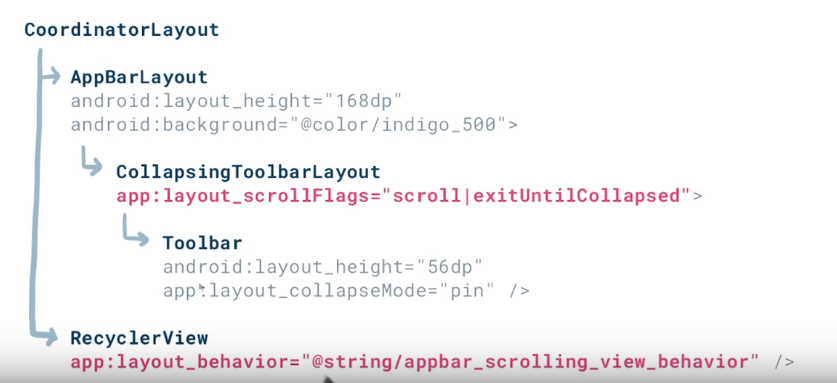
What is AppBarLayout and ToolBar?
AppBarLayout allows your Toolbar and other views (such as tabs provided by TabLayout) to react to scroll events in a sibling view marked with a ScrollingViewBehavior.
why CollapsingToolbarLayout?
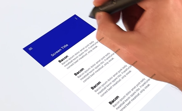
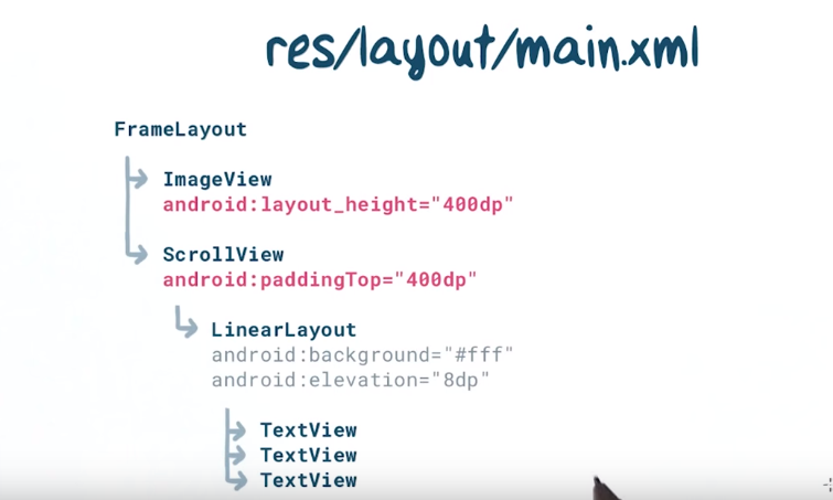
Making Scrollable Dynamic Surfaces
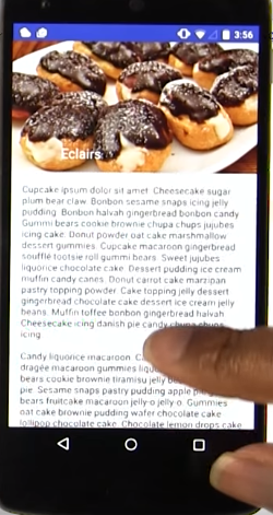
scroll up,the picture disappear,hot to do this?
<android.support.design.widget.CoordinatorLayout xmlns:android="http://schemas.android.com/apk/res/android"
xmlns:app="http://schemas.android.com/apk/res-auto"
android:layout_width="match_parent"
android:layout_height="match_parent">
<android.support.design.widget.AppBarLayout
android:id="@+id/app_bar_layout"
android:layout_width="match_parent"
android:layout_height="192dp"
android:background="?colorPrimary">
<android.support.design.widget.CollapsingToolbarLayout
android:id="@+id/collapsing_toolbar_layout"
android:layout_width="match_parent"
android:layout_height="match_parent"
app:collapsedTitleTextAppearance="@style/TextAppearance.AppCompat.Widget.ActionBar.Title.Inverse"
app:expandedTitleTextAppearance="@style/TextAppearance.AppCompat.Widget.ActionBar.Title.Inverse"
app:expandedTitleMarginStart="72dp"
app:contentScrim="?attr/colorPrimary"
app:layout_scrollFlags="scroll|exitUntilCollapsed">
<ImageView
android:layout_width="match_parent"
android:layout_height="match_parent"
app:layout_collapseMode="parallax"
android:scaleType="centerCrop"
android:src="@drawable/eclairs" />
<android.support.v7.widget.Toolbar
android:id="@+id/app_bar"
android:layout_width="match_parent"
android:layout_height="?actionBarSize"
android:theme="@style/ThemeOverlay.AppCompat.Dark.ActionBar"
app:navigationIcon="@drawable/arrow_left"
app:contentInsetStart="72dp"
app:layout_collapseMode="pin" />
</android.support.design.widget.CollapsingToolbarLayout>
</android.support.design.widget.AppBarLayout>
<ScrollView
android:layout_width="match_parent"
android:nestedScrollingEnabled="true"
app:layout_behavior="@string/appbar_scrolling_view_behavior"
android:layout_height="wrap_content">
<TextView
android:layout_marginTop="16dp"
android:textAppearance="@style/Base.TextAppearance.AppCompat.Body1"
android:text="@string/cupcake_ipsum"
android:layout_width="wrap_content"
android:layout_height="wrap_content"
android:layout_marginLeft="16dp"
android:layout_marginRight="16dp" />
</ScrollView>
</android.support.design.widget.CoordinatorLayout>
|
explain:
first see the below article
Android M新控件之AppBarLayout,NavigationView,CoordinatorLayout,CollapsingToolbarLayout的使用:
ref:
Android M新控件之FloatingActionButton,TextInputLayout,Snackbar,TabLayout的使用
ref:
Quize:

1and 3 will stay in place,becasue the app bar has different elevation,the below content will across them.
Material DESIGN~Bold Graphic Design
use 格式塔心理學理論
1.
2.
3.
Grids and Keylines
The Google design spec hosts a number of templates in Adobe Illustrator format (.ai) and Photoshop and Sketch (look at the components links near the top).
Grids
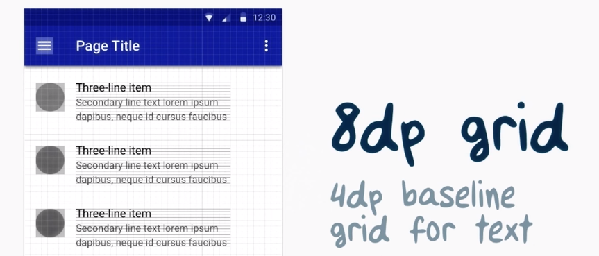
material design use 8dp grid align component
4dp baseline grid for text
zoom in
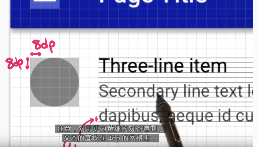
we can see that the 4dp grid is the subse tof the 8dp grid
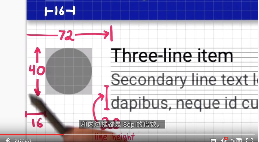
so,we can see thet everything is the multiple of 8dp
line height is multiple of 4
Keylines
use to align the object,can use in horizontal and vertical,it make the UI 井然有序
hele is some common keyline
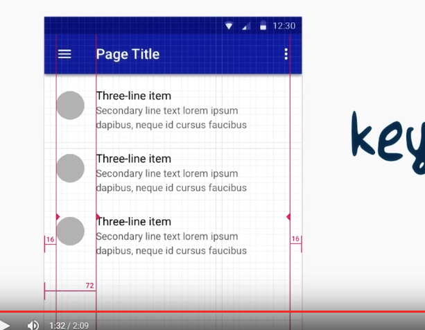
the 16dp for icon ..輔助內容
72dp for primary content
if do not have 輔助內容,primary content align to the 16 dp leyline
Use Metrics as a example to see how to apply principle to the app in android studio
source code:
define the keyline and gridle in different dimens.xml file

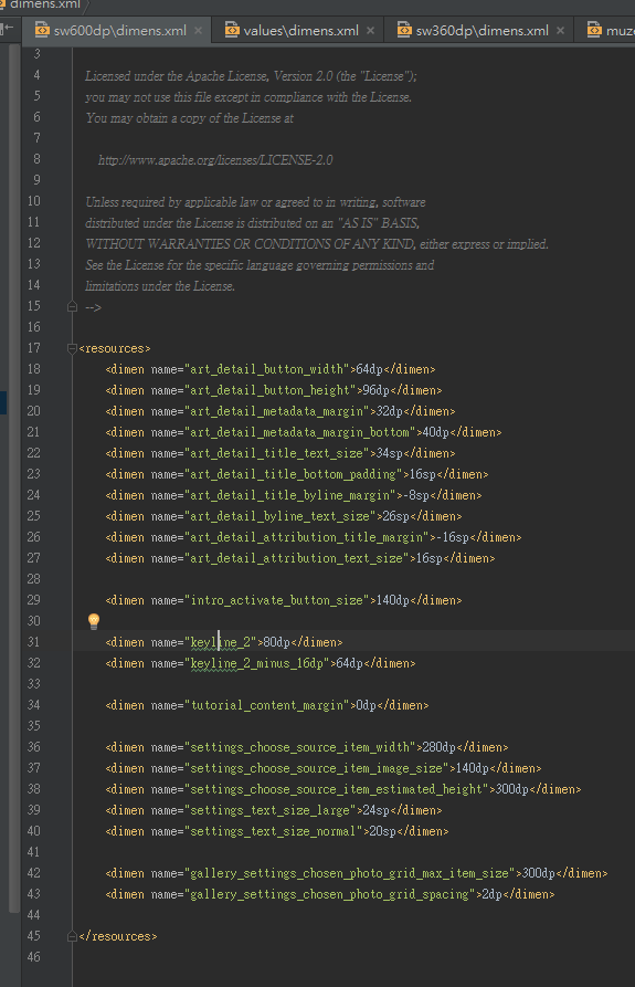
than use it in the style file
for example:

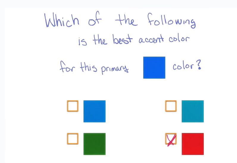
Color and the Material Design Palette
color can tell us many information,is the food good?Battery state?
the material design has primary color and senondeary color.
we can choose color from here;
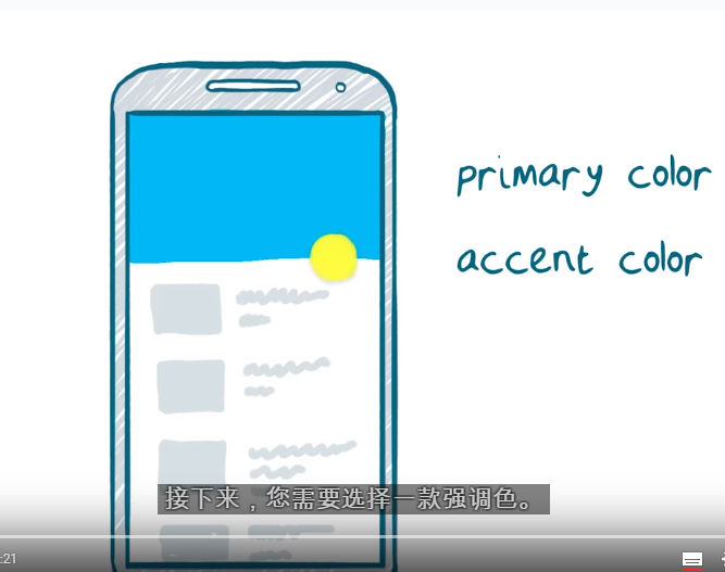
primary color is the brand color.for example,
youtube primary color is red,facebook is blue
accent color get the atention of the peolpe.
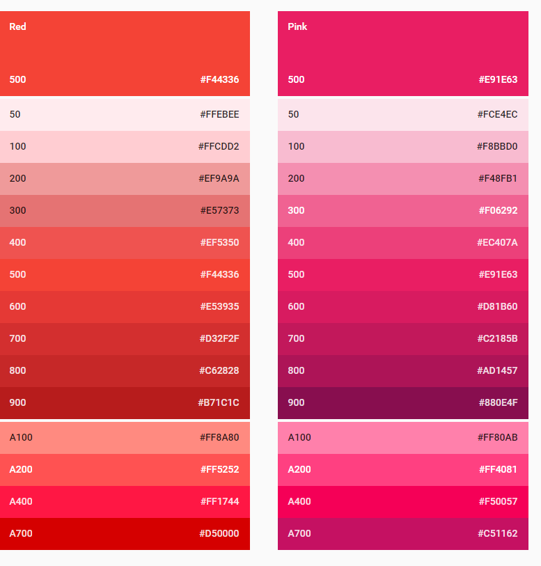
primary color is 500
the color start by A is use in accent color
we will use 1 primary color ,2 color near primary and 1 accent color
example:

ti help you to choose the accet color.
Applying a Color Palette
first,add the color to the colors.xml
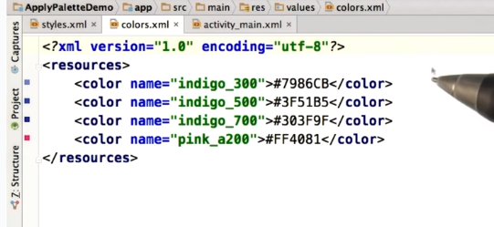
second,appl to the theme

third,apply to different component
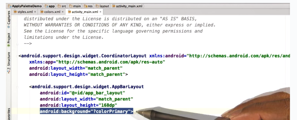
?colorPrimary
mean get the value from the theme
Pick The Best Accent Color
Picking a Palette From an Image
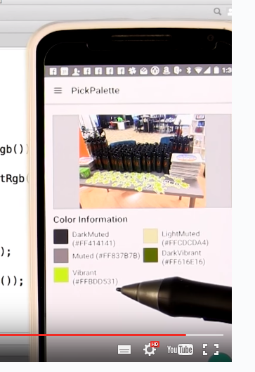
the code of the example:
Scale Independent Pixels(text size)DP and SP
user can custom their fint size.
for example,we set a font size is 16sp
sp
|
seting
|
dp
|
16
|
normal or 100%
|
16
|
16
|
large or 125%
|
20
|
Font Characteristics
default Font is Roboto in Android
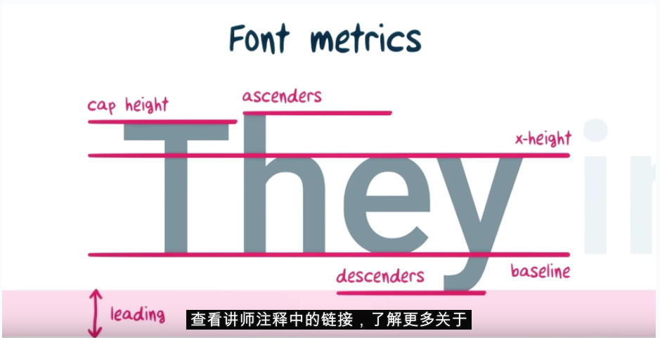
explain at here:http://typedia.com/learn/only/anatomy-of-a-typeface/
x-hieght:The height of the main body of a lowercase letter.
baseline:The invisible line where letters sit.
cap height:The distance from the baseline to the top of a capital letter.
ascenders:An upward vertical stroke found on lowercase letters that extends above the typeface’s x-height.
descenders:A downward vertical stroke found on lowercase letters that extends below the baseline.
leading:’
Font Family and Style
a font ,have Family,weight,style

in android:
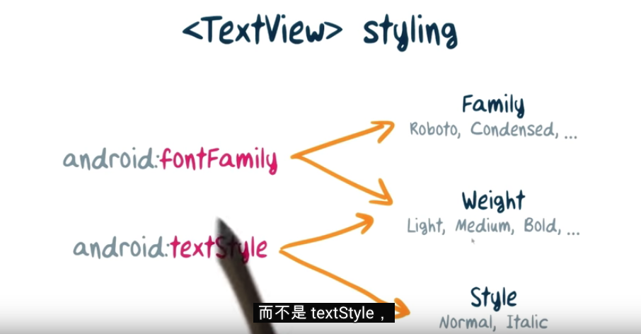
although fontFamily and textstyle also can set the weight ,but we should set at fontFamily
see same example:


what is serif?
“Feet” or non-structural details at the ends of some strokes.
what is sans-serif:
Adding a Custom Font
Images
Making Images More Immersive(Scale the picture)

detail:https://youtu.be/Y-izykJ7pi8
ScaleType information:http://developer.android.com/intl/zh-tw/reference/android/widget/ImageView.ScaleType.html
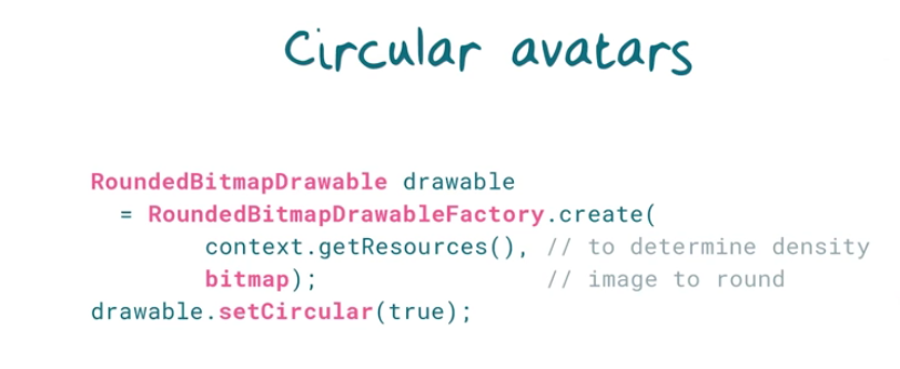
Circular Avatars
something like that,the picture in the circle
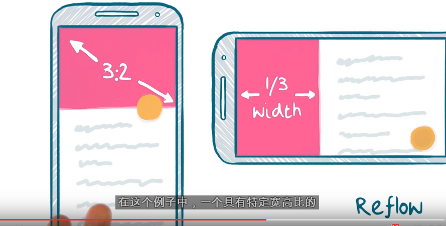
Aspect Ratio Images(keep the ration)
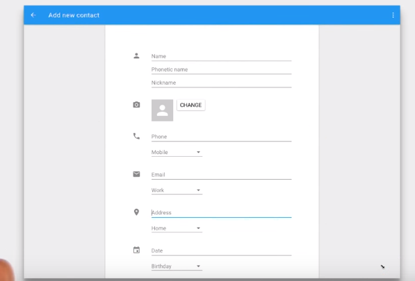
for example,whatever the resoultion and the ration of the pricture,we want it show in 3:2, what can we do?
1
create a new type that extends ImageView
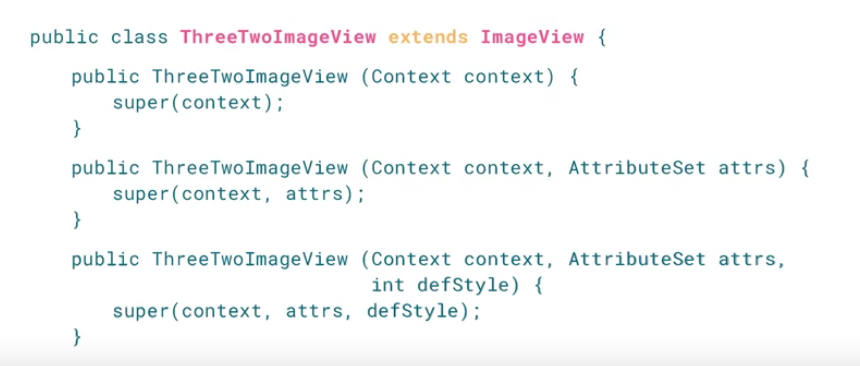
2.
override the onMesure
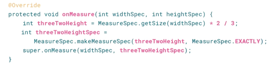
Explain:
the concept is use the width to calculate the heigh,to keep the ⅔ ratio.
般来说,自定义控件都会去重写View的onMeasure方法,因为该方法指定该控件在屏幕上的大小。
protected void onMeasure (int widthMeasureSpec, int heightMeasureSpec)
onMeasure传入的两个参数是由上一层控件传入的大小,有多种情况,重写该方法时需要对计算控件的实际大小,然后调用setMeasuredDimension(int, int)设置实际大小。
onMeasure传入的widthMeasureSpec和heightMeasureSpec不是一般的尺寸数值,而是将模式和尺寸组合在一起的数值。我们需要通过int mode = MeasureSpec.getMode(widthMeasureSpec)得到模式,用int size = MeasureSpec.getSize(widthMeasureSpec)得到尺寸。
mode共有三种情况,取值分别为1.MeasureSpec.UNSPECIFIED, 2.MeasureSpec.EXACTLY, 3.MeasureSpec.AT_MOST。
MeasureSpec.EXACTLY是精确尺寸,当我们将控件的layout_width或layout_height指定为具体数值时如andorid:layout_width="50dip",或者为FILL_PARENT是,都是控件大小已经确定的情况,都是精确尺寸。
MeasureSpec.AT_MOST是最大尺寸,当控件的layout_width或layout_height指定为WRAP_CONTENT时,控件大小一般随着控件的子空间或内容进行变化,此时控件尺寸只要不超过父控件允许的最大尺寸即可。因此,此时的mode是AT_MOST,size给出了父控件允许的最大尺寸。
MeasureSpec.UNSPECIFIED是未指定尺寸,这种情况不多,一般都是父控件是AdapterView,通过measure方法传入的模式。
@Override
protected void onMeasure(int widthMeasureSpec, int heightMeasureSpec) {
setMeasuredDimension(getMeasuredLength(widthMeasureSpec, true), getMeasuredLength(heightMeasureSpec, false));
}
private int getMeasuredLength(int length, boolean isWidth) {
int specMode = MeasureSpec.getMode(length);
int specSize = MeasureSpec.getSize(length);
int size;
int padding = isWidth ? getPaddingLeft() + getPaddingRight()
: getPaddingTop() + getPaddingBottom();
if (specMode == MeasureSpec.EXACTLY) {
size = specSize;
} else {
size = isWidth ? padding + mWave.length / 4 : DEFAULT_HEIGHT
+ padding;
if (specMode == MeasureSpec.AT_MOST) {
size = Math.min(size, specSize);
}
}
return size;
}
|
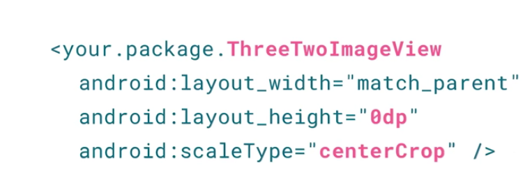
3.use it
Background Protection

can not see the Title,use Scrim
How to implement?
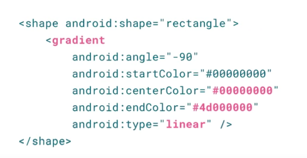
than use frame layout put it together

image at the bottom
the scrim above the image
Text at the top,will not effect by the scrim
Material Design_Meaningful Motion (Animation)
use the physical motion in the real world,make user more easy understand your APP
have few type of Animation in different version
<4.0
|
1.only can use AnimationSet
|
>=4.0
|
2.can use :ViewPropertyAnimator
3.Transition Manager
|
>=4.4(API19)
|
4.Newer Animation APIs
|
>=5.0
|
5.Activity and Fragment Transitions
6.Share element Transitions
7.nstructive Motion
8.AnimatedVectorDrawables
|
Animation on Android
before Android 4.0
set the animation we need to use AnimationSet
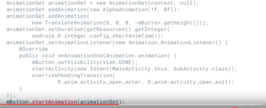
the concept is create a AnimationSet,and add different animation to it,when animation finish,do something.
also can set the Animation by the XML
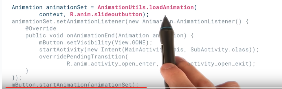

ref:
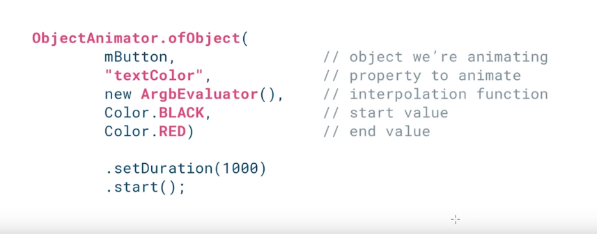
>=Android 4.0
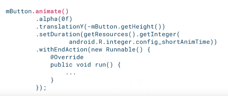
any property of any object can be a animation
the Below is use text Color to be a animation
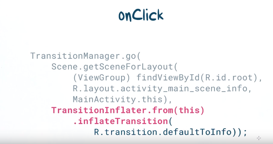
Introduction to Transition Manager
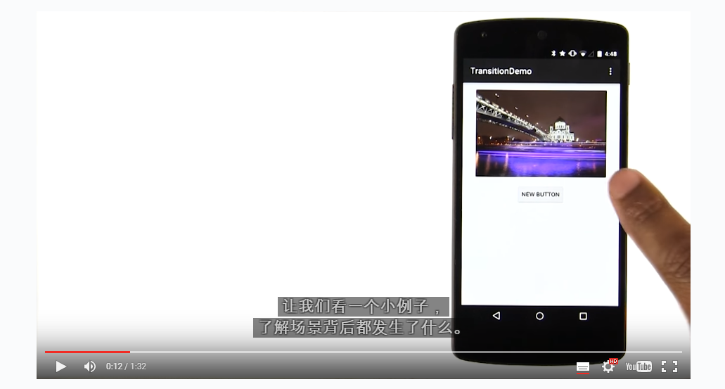
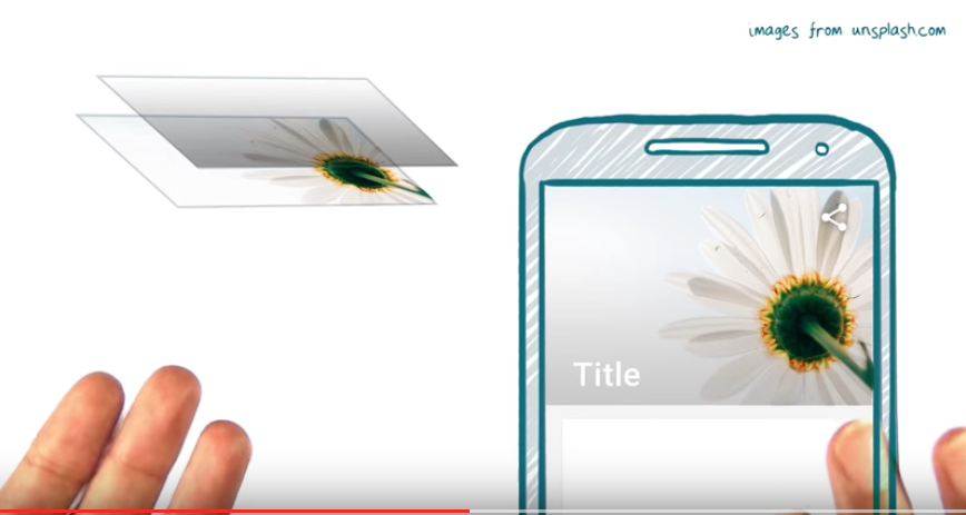
the picture slide up and disappear when we click the button.
Transition Manager use Scene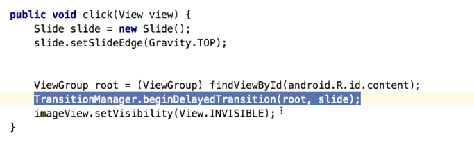
concept:
Slide is a type of transaction
TransitionManager use Scene.
Scene is
A scene represents the collection of values that various properties in the View hierarchy will have when the scene is applied. A Scene can be configured to automatically run a Transition when it is applied, which will animate the various property changes that take place during the scene change.
TransitionManager save the scene of the start state
TransitionManager also save the scene of the end state
Than it add the transaction between two scene
by the last code ,TransitionManager know the last state of all the view after the transition
the transition happen on the aobject that has different between before transition and finish transition
different type of transaction

Newer Animation APIs


the above is two scene
different component have different animation
some disappear,some appear,
how to do that?
first create two layout

stpe 2,from one scene go to another scene

android will auto fuiger out the transaction for you.
we also can make define the transaction by our self

Activity and Fragment Transitions in Lollipop-Activity Exit
more detail can see :http://www.androiddesignpatterns.com/2014/12/activity-fragment-transitions-in-android-lollipop-part1.html
the Transition not only have explode
explode - Moves views in or out from the center of the scene.
slide - Moves views in or out from one of the edges of the scene.
fade - Adds or removes a view from the scene by changing its opacity.
|


Activity and Fragment Transitions in Lollipop-Activity Enter

Activity and Fragment Transitions in Lollipop-Activity reEnter

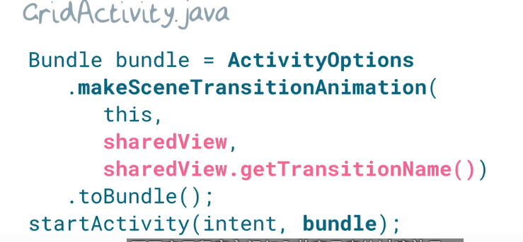
Share element Transitions
implement:
1.identify the share elements name :the name should be the same
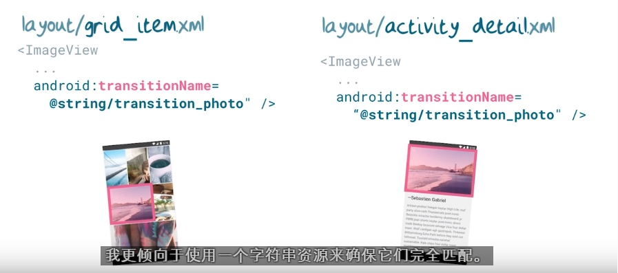
2.code
Implementing Instructive Motion
go in to the app,show the whole picture,and tham auto slid up the text

the onEnterAnimationComplete only appear in the Android5.0
but in other android version,we can use delay to do that
we move the scroll view
Design to Enhance
~300ms
Introduction to AnimatedVectorDrawables(the animation on Vector Drawable)aonly for >=android 5.0
the ceod:
Nick's Heart-fill demo code:https://github.com/udacity/ud862-samples/tree/master/HeartFill
Nick's TickCross demo code:https://github.com/udacity/ud862-samples/tree/master/TickCross
Animation can on 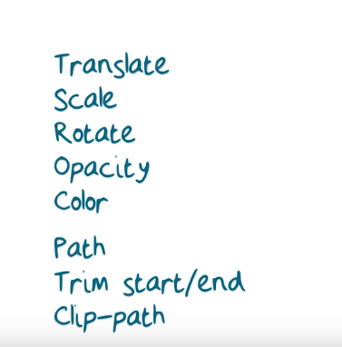
Use TickCross demo as a example,the animation is path
step1 create the tick and cross vector icon
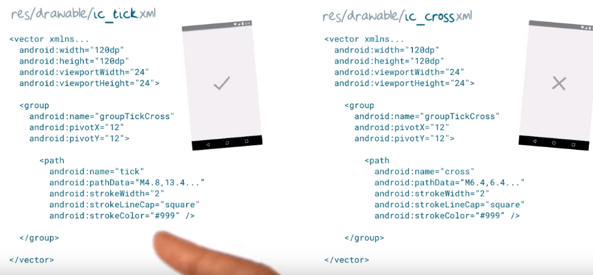
android:viewportWidth
Used to define the width of the viewport space. Viewport is basically the virtual canvas where the paths are drawn on.
The pivotX and pivotY is the central point of the animation.
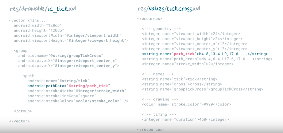
step2 put the vector path into the strin,more clear
step3 create Animator

step4 create animated vector drawable
create a drawable that have animation

step5 start the animation

Material Design_AdaptiveDesign
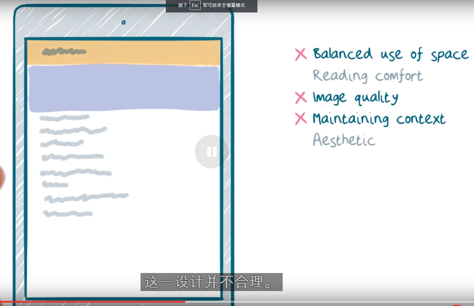
Examples of Non Optimal Tablet UIs
this is the condition:

3example, that has some problem
1.

not balances use of space:left align,mak right isde has many empty space
no reading confort: full width text should be between 45 to 75 chrater
no image quality: becasue the screen ,make the image bigger,quality down
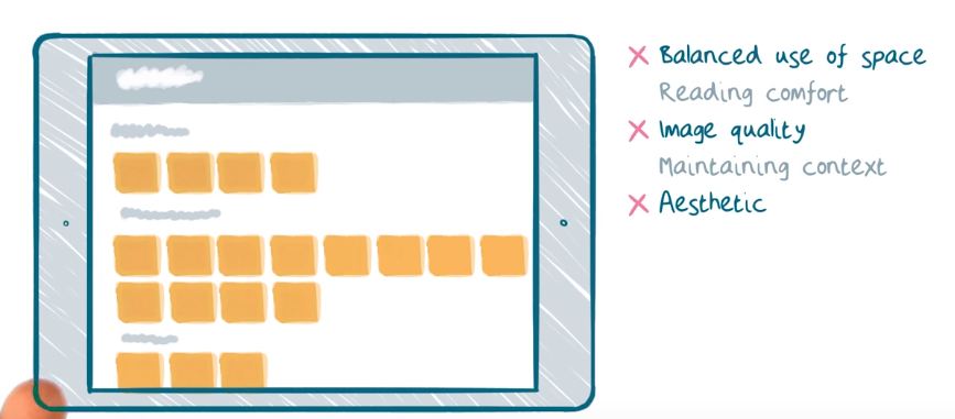
2.
no balances use of space:most of the content at the left side
no image quality,same above
no maintaining context:still have many space at right and below
3.
no balanced use of space:hogh density at the left side,right little
no image quality,not talking about the image is extend,is talk about the image should be show in a more fun,richly and interesting way. every picture is fix size,can be different size.
no aesthetic(審美):參差不齊
Material Design_AdaptiveDesign_Breakpoints and Content First
what is break point?
we change the UI base on the screen size,the point wehen UI change,is break point.FOr example,at >=sw600dp ,the ui chnge ,the break point is 600dp
How to determine the break point?
we think content first.that mean think about the limit of the content ,than calculate the breaking point.
for example:
1.
when screen bigger
read difficult,the text too long,it should be between 45 to 75,
so,the break point is below
example2
screen biger

righ size have many space,no balances use of space
so break point at here

example3


the picture,the button is strengh
break point at

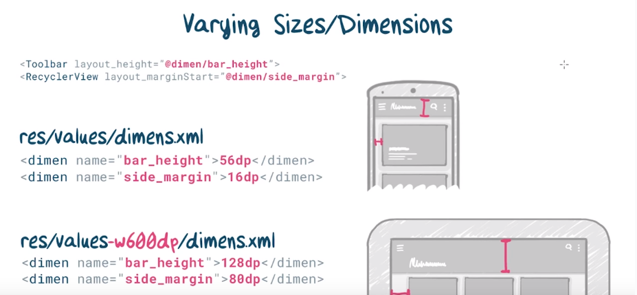
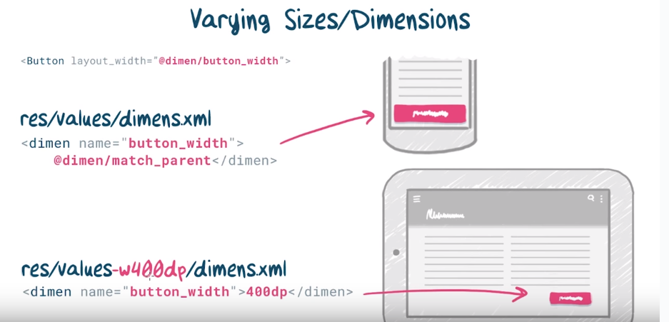
How to implement breakpoints
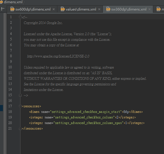
use resource qualifier

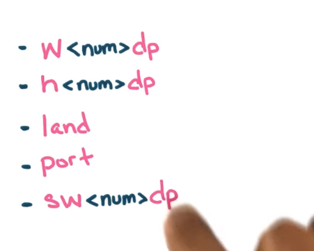
w<num>dp and h<num>dp will cahnge when rotate
sw<num>dp will not change when rotate,get the smaller value
different device dp:https://design.google.com/devices/
Different Techniques for adaptive design
1.
at mobile ,hide the negavition part
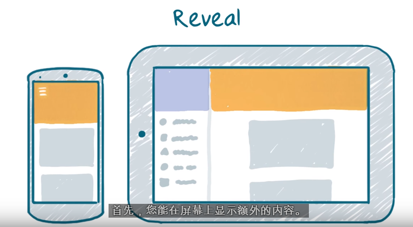
2.
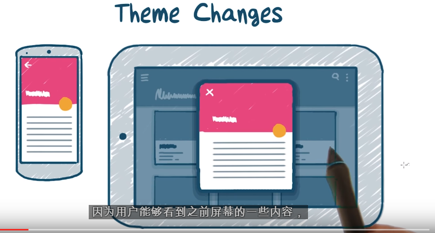
in the tablet show the detail inf.no need jump to a new activity or fragment
3.
rearrage the display flow.
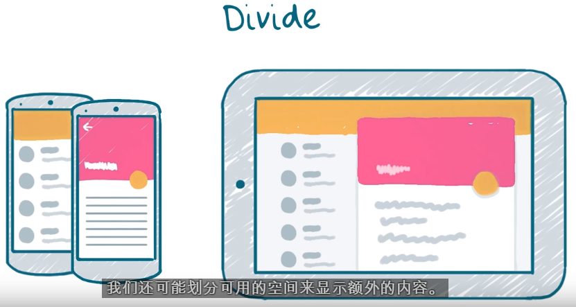
another reflow
4.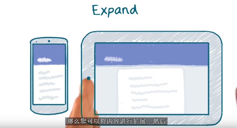
if no other information can add to the screen,can use this method.
5.use dialog
implement

why we need MyTheme<BaseTheme<Theme.AppCompat and
MyTheme<BaseTheme<Theme.AppCompat?
becuase do this,we can put the theme attributes at a place
The way to implement adative layout
part1
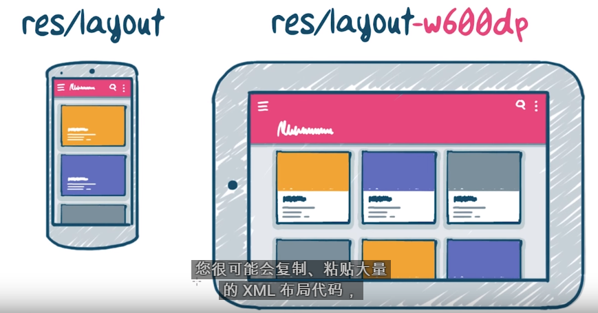
we can see that these layout have many part is the same,if use different layout,just copy many times,
so we can use
include layout
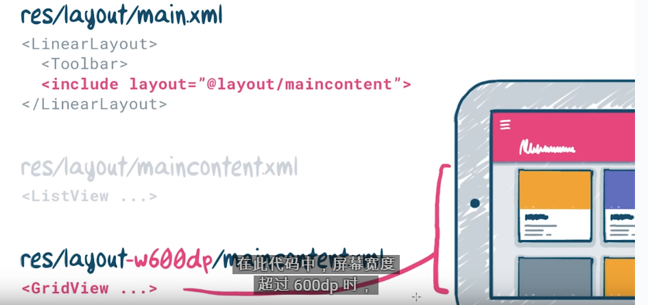
show when at w600dp,will load the Gridview,otherwise,load Linear layout.
part2
Integer resource
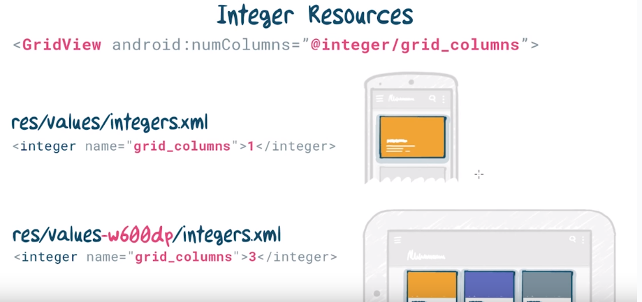
load different layout accroading the integer
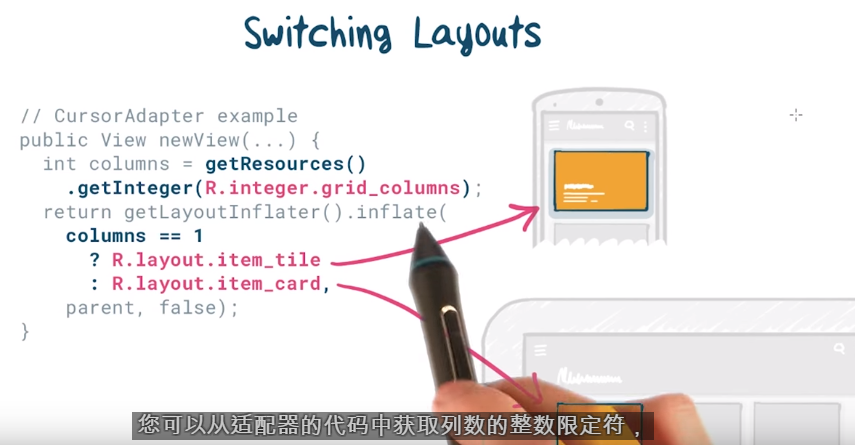
another example 1
another example 2
becareful,need to add this

becuase the match_parent just a number -1,no unit
other example 3

Newly Optimized Tablet UIs
example1
example2

example3

responsive UI: